TOPS Manufacturing
UI UX design, Frontend Dev
TOPS Equipment
Check out the live site here:
Users & audience:
The audience of this website is for businesses, agriculture, petroleum, and service station owners and workers.
Company details:
TOPS Equipment and Manufacturing Company specializes in design, manufacturing and after-marketing of specialized products in the fuel and chemical industries. TOPS products are manufactured in various parts of the world including the United States, China and Europe. The TOPS branded products are sold through wholesale distribution or ecommerce. Each product has been carefully selected for the TOPS brand based on quality, pricing and warranties. By working with various manufacturers throughout the world TOPS provides a vital role for many small wholesale distributors by providing large volume discounts on small orders. TOPS will continually seek out quality products to add to its growing brand.
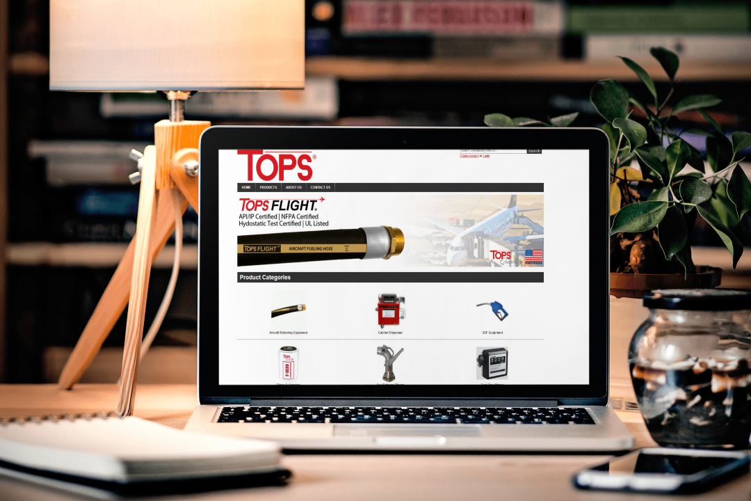
With the home page we wanted to bring more visuals to make navigation easier for the user. We wanted to add more attention towards our logo and decrease the amount of written text. We removed the text on the logo image and increased the scale of the logo. We also removed the black background from the header to add more flow and continuity to the site. We then added images to the categories section.
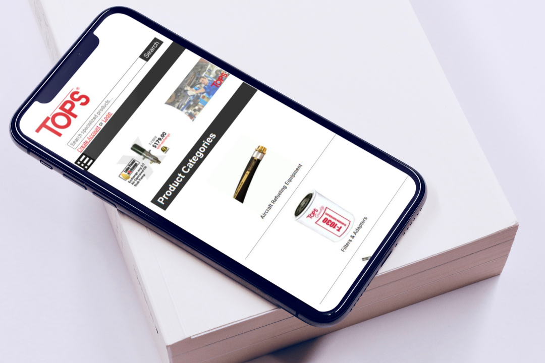
The mobile version of the home page was in need of some scaling issues. With adding of the images to the categories and putting in a flex box to make the pages more responsive. One of the complications I had with designing the mobile version was the search bar wasn't in it's own div block so place margins and padding on it was difficult. Also with how the PHP pulls the categories from the backend ordering these categories alphabetically wasn't possible from just altering the CSS. In the tablet display the text under the images would align differently making the dotted line under each category not match up. To solve this problem I changed the CSS at 770 px to remove the line and reappear for smaller devices.
Roles & Responsibilities
My main goal for this project was to help the user experience and make the site fully functional for both mobile and desktop. For this project I used Figma to get a block design done for approval. Once that was approved I then was began to alter and change the CSS and some of the PHP of our development site. As I was altering that I would report to my supervisor for approval. Once those changes were approved the back end developer shifted the changes over from the dev site to the live site.
Scope & Constraints:
I had certain constraints due to the website was initially coded in a table. Also a lot of the elements were designed with inline styling. Finding certain elements that was difficult also adding classes and id's to the resolution setting for tablets and mobile devices. One great thing about this project was being able to make all the changes to the development site and not the live site. Overall the changes have greatly improved the design and flow of the website. I would've like to be able to fix the order of the categories on the home page and also edit other elements via css and no in the php inline coding.